
Fig. 6.
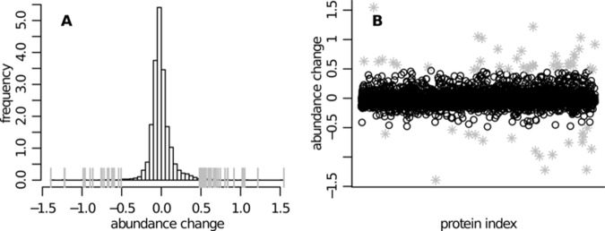
Human SILAC dataset—distribution of the difference between the protein abundance estimates in the treated and in the control case (Dj = Ĉjtreated − Ĉjcontrol). A, distribution of the estimated abundance changes. B, scatter plot of the protein identification number versus the estimated abundance difference. The two panels show essentially the same information. Particularly high score differences are highlighted (gray ticks in A and gray asterisks in B).