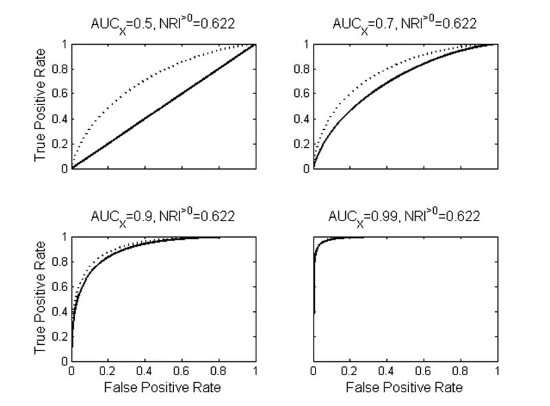
Figure 1.

In each plot the solid line is the ROC curve for the “old” marker and the dotted line is the ROC curve for the “new” risk model that incorporates the new marker. The new marker has identical distribution in all four cases. NRI>0=0.622 in all cases, despite the fact that the prediction increment of the new marker decreases as the strength of the old model increases.
