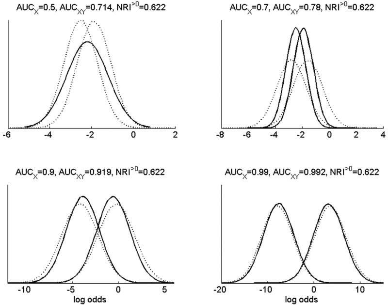
Figure 2.

The same data as Figure 1 are shown here in terms of the distributions of risks for old and new risk models. Risk distributions are shown on the log odds scale. Solid lines are the risks using the established predictors X, with nonevents tending to have lower risks than events. Dotted lines are risks using the new marker Y together with X.
