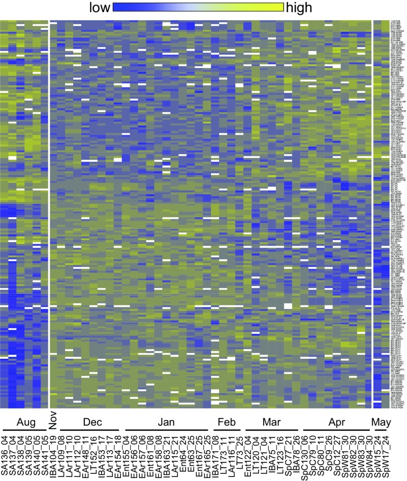
Fig. 6.
Chronological heat map. A hierarchically clustered heat map arranged chronologically along the x-axis displays the annual cycle of identified protein spot abundance data differing among hibernation states (y-axis, right: spot number.spot identity). Each animal sampled from a physiologically defined state (stateID_dd) is ordered chronologically (August 4–May 24). White break points in the heat map represent gaps between sampling dates longer than 1 mo.

