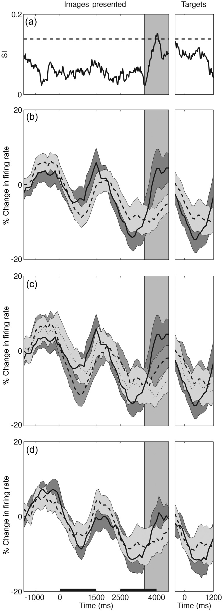
Figure 3.
Time courses of DLPFC population responses (n = 42). (a) SI for the population activity across all conditions with the dotted horizontal line indicating the upper 95% bound by bootstrap analysis. The normalized population firing rate ± SEM (shaded region) is shown for (b) act on (i.e. TO; solid line) versus similar criterion (i.e. TT/OO; dashed line) trials; (c) TO (solid) versus TT (dashed) versus OO (dotted) trials; and (d) trials in which items were matched (solid) versus nonmatched (dashed). Activity is aligned to the first image presentation (left), and red–green target presentation (right). The horizontal scale bars in (d) indicate the first and second image presentation periods. The shaded vertical region indicates the second image delay period, the center of which corresponds to the maximal SI (peak in a).

