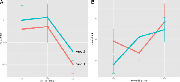
Figure 1.

The norm of reaction. The responses of two genotype groups to two environmental manipulations (two different cities) were plotted on the same graph such that the phenotypes exhibited by different areas could be compared. Data points represent the mean phenotypic expressions of control (systolic blood pressure; panel A) and supra-iliac skinfold thickness (panel B) of individuals with similar genotype profiles. Error bars denote the standard errors of the means. Blue lines indicate area 2 (Ansan); red lines represent area 1 (Ansung).
