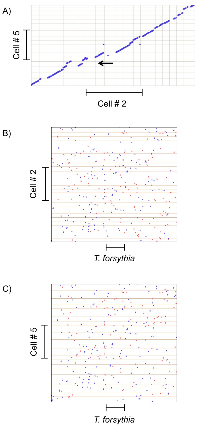
Figure 3. Promer dot plots showing extent of synteny between genomes.

The program compares amino acid translations of the genomic sequences. Blue dots indicate identity from + to + or − to − strands, red dots indicate identity from + to − or − to +. The gray grid lines indicate the borders of contigs in the draft assemblies. The bars indicate lengths of 500 kb. A) Plot of the 20 largest contigs of BU063 cell no. 5 assembly against the 20 largest contigs of the cell no. 2 assembly. In either case about half the genome is represented. Note that the program attempts to flip and order contigs to generate a diagonal but this is not fully possible because of missing regions. One non-syntenous region is shown with the arrow. B) Plot of the 20 largest contigs of cell no. 2 vs. T. forsythia C) Plot of the 20 largest contigs of cell no. 5 vs. T. forsythia.
