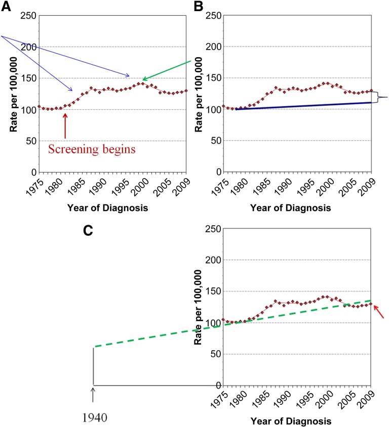
Figure 2.
Age-adjusted incidence of female breast cancer, 1975–2009, adapted from the Surveillance Epidemiology and End Results database at http://seer.cancer.gov/faststats/selections.php?#Outputlastaccessed7/20/2010. (A): The rise in cancer incidence in the mid-1980s (blue arrows) was related to the, apparently annual, increase in participation in screening mammography. More and more women participated in screening until 1999, when participation appears to have leveled off (green arrow). This likely accounts for the decline in incidence from 1999 to 2006, as incidence returned toward the baseline. The baseline appears to have continued to increase at 1% per year from 2006 to 2009. (B): Bleyer and Welch estimated that had there been no screening, incidence would have increased from 1974 to 2008 by only 0.25% (blue line), leading them to conclude that the difference between the actual numbers (red dotted line) and their estimate must be the result of overdiagnosed cancers [42]. (C): If Bleyer and Welch had used the 40 years of data from the Connecticut Tumor Registry, which showed a baseline increase of 1% per year (green dotted line) from 60 per 100,000 in 1940 and confirmed by the fact that from 2006 to 2009 the incidence returned to 1% per year (red arrow), they would have found that the actual number of invasive breast cancers (red dotted line) fell below what would have been expected had there been no screening. Based on their methodology, screening actually led to fewer cancers than would be expected. There was certainly no overdiagnosis of invasive cancers.

