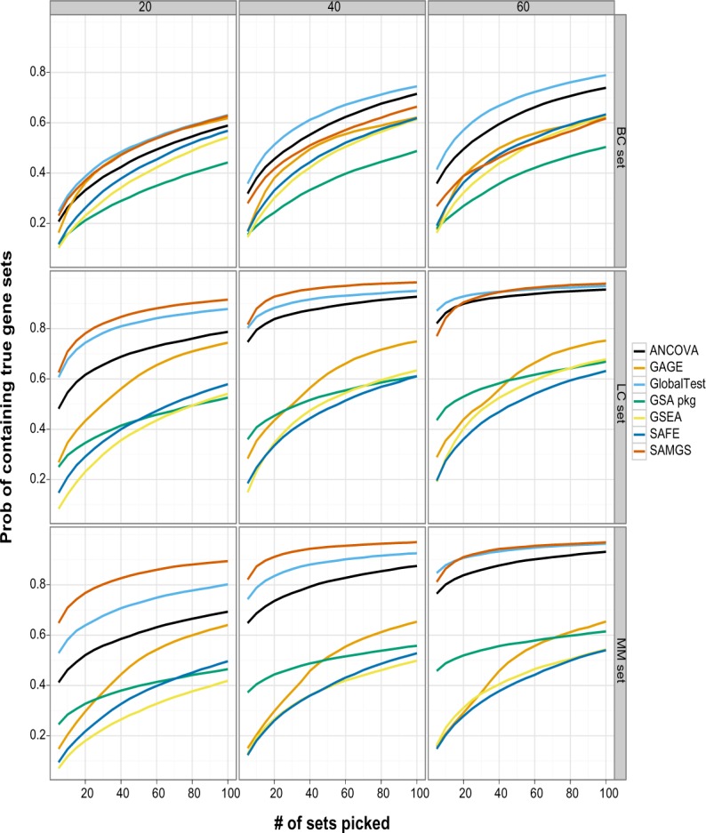
Figure 4.

This graph compares GSA methods on ranking the true sets for different data sets and sample sizes. The x axis is the number of top gene sets, and the y axis is the percentage of cases that the true set is among the selected top gene sets. Gene sets: C2. All gene sets used.
