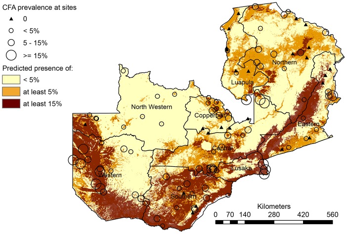
Figure 4. Map resulting from the overlay of the thresholded versions of the maps in Figure 4.
The map depicts areas of predicted presence of ≥15% CFA prevalence (brown), ≥5% CFA prevalence (orange+brown) and areas where no or <5% CFA is predicted to be present (light yellow).

