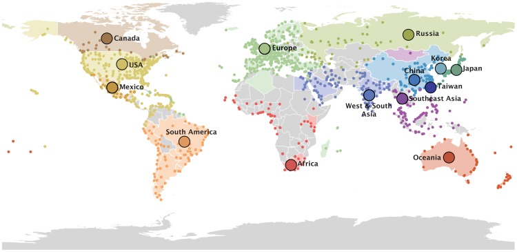
Figure 1. 14 global air communities identified through a modularity maximization analyses of air transportation data.
The colored dots represent the airports in each community for which passenger flux data was used in the analysis. The areas with corresponding colors represent the geographical area within the communities for which H3N2 sequence samples were available. The 14 communities and associated data are listed in Text S1.

