
Figure 1. Data visualization with box plots.
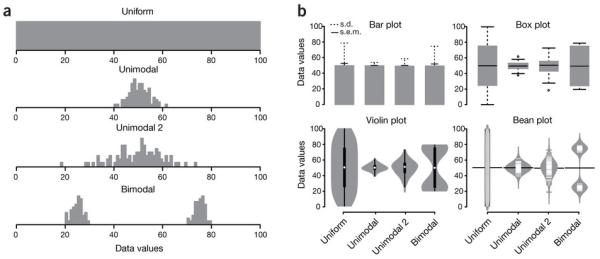
(a) Hypothetical sample data sets of 100 data points each that are uniform, unimodal with one of two different variances or bimodal. Simple bar plot representations and statistical parameters may obscure such different data distributions. (b) Comparison of data visualization methods. Bar plots typically represent only the mean and s.d. or s.e.m. Box plots visualize the five-number summary of a data set (minimum, lower quartile, median, upper quartile and maximum). Violin and bean plots represent the actual distribution of the individual data sets.