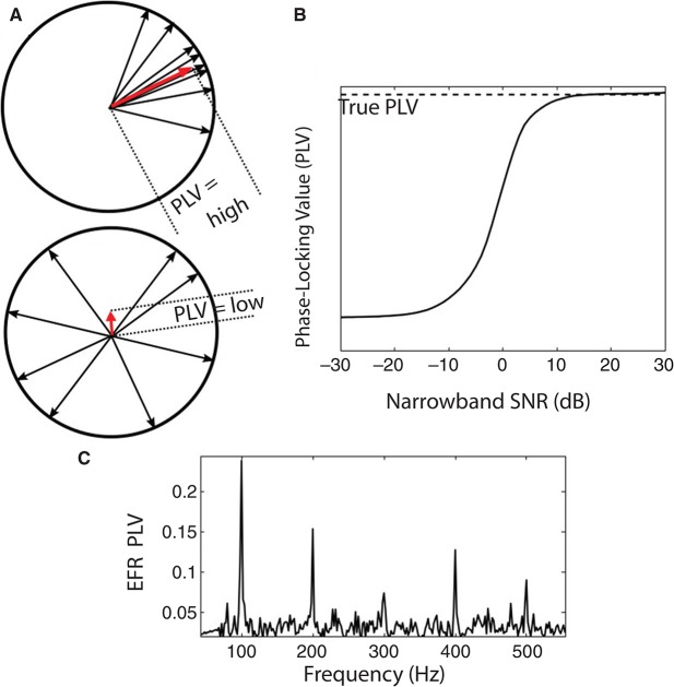
Figure 3.
(A) An illustration of the PLV metric computation. The SSSR from each trial is represented by a vector (phasor, shown as a black arrow) with unit magnitude and with phase equal to the EFR phase at the frequency bin of analysis. The vector average of these phasors is computed; the magnitude of the resultant vector (shown as red arrow) yields the PLV. The top panel is an example with high PLV: the phase of the responses varies over a narrow range across trials. The bottom panel is an example with low PLV: response phase relative to stimulus onset is essentially random over the unit circle. (B) Relationship between the single-trial SNR of the measurement in the frequency bin of interest and the estimated PLV for a simulated signal in additive noise. At sufficiently high SNR values, the estimated PLV converges to the true PLV (aside from a small sample bias that depends on the number of trials). At lower SNRs, the estimate is biased to be lower than the true value. This is an important consideration when comparing PLVs across sound levels or individuals, since the SNR depends on the magnitude of the true underlying response, the geometry of the generators, and the volume conductor in between. (C) Sample PLV spectrum obtained in response to a 100 Hz transposed tone at a carrier frequency of 4 kHz at 65 dB SPL (RMS). Strong peaks are evident in the PLV at multiples of the envelope frequency.

