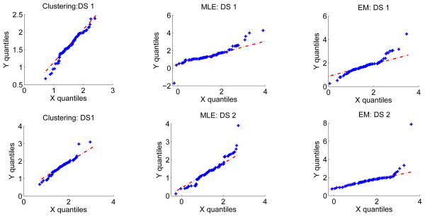
Figure 2.
Consistency check: The Q-Q plot comparing the histogram of automated ADC values to the theoretically-estimated distribution for the clustering, MLE and EM-based segmentation algorithms and for the two simulated lesion datasets: DS1 and DS2. The quantiles of the theoretically-estimated distribution and the measured ADC distribution are plotted along the x and y axis, respectively. The 45° line is also plotted for visual convenience. We observe that the Q-Q plot lies approximately along the 45° line in all the scenarios, thus confirming that the measured and estimated distributions are consistent with each other.

