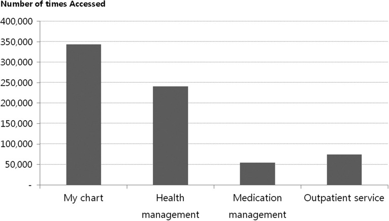
Fig. 7.
The number of times each service of My Chart in My Hand was accessed. The number of accesses for each service within My Chart in My Hand from its launch up until December 2012 is displayed. Because there are no log data for the “Health information” menu, the graph does not show how many times it was accessed.

