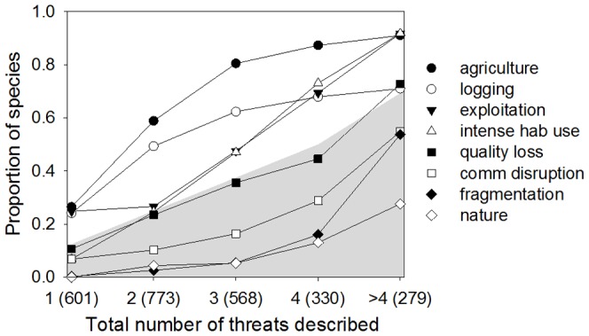
Figure 2. Threat prevalence for species with distinct numbers of listed threats (levels).

The number of species in each level is indicated in parenthesis (species in all Red List status are included). Values that fall within the shaded area indicate fewer species than expected if all threats were equally likely (e.g., for species with one threat the expected proportion of species suffering from each threat is 1/8, for two threats is 2/8, etc. For >4 threats the proportion was calculated based on the mean number of threats = 5.6).
