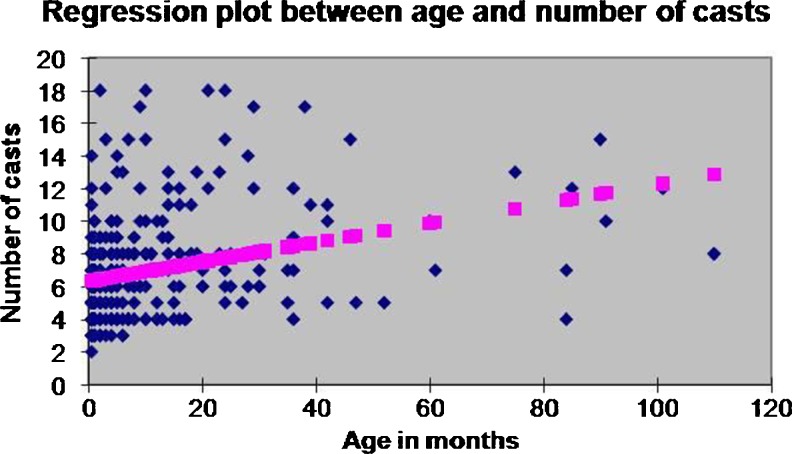
Fig. 2.
The X variable 1 line-fit plot depicting the regression analysis between age and the number of corrective casts. The pink dots show the predicted number of casts on the basis of age and the blue dots show the actual number of casts. The point from where the pink dots start is the intercept which is the average minimum number of casts

