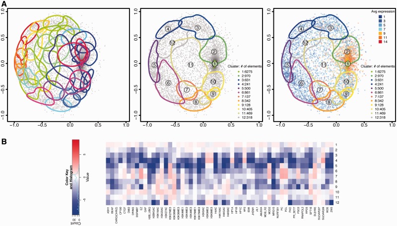
Figure 5.
chroGPSgenes map of S2 cells. The map was generated using Tanimoto distances and BoostMDS for representation. (A) Analysis of the map based on hierarchical clustering with average linkage. Clusters corresponding to 50% between-cluster distance before (left) and after unsupervised merging (center). On the right, the average log2 gene expression level is indicated. For each cluster, the 75% density contour is shown. The number of elements in each cluster is indicated. (B) The epigenetic profiles of the 12 merged clusters in Figure 5A (center) are presented. For each cluster, the log2 enrichment/depletion ratio of each factor with respect to its average distribution in the whole map are indicated. See also Supplementary Video S2 for visualization of the 3D-map in motion (Supplementary Section S10.1).

