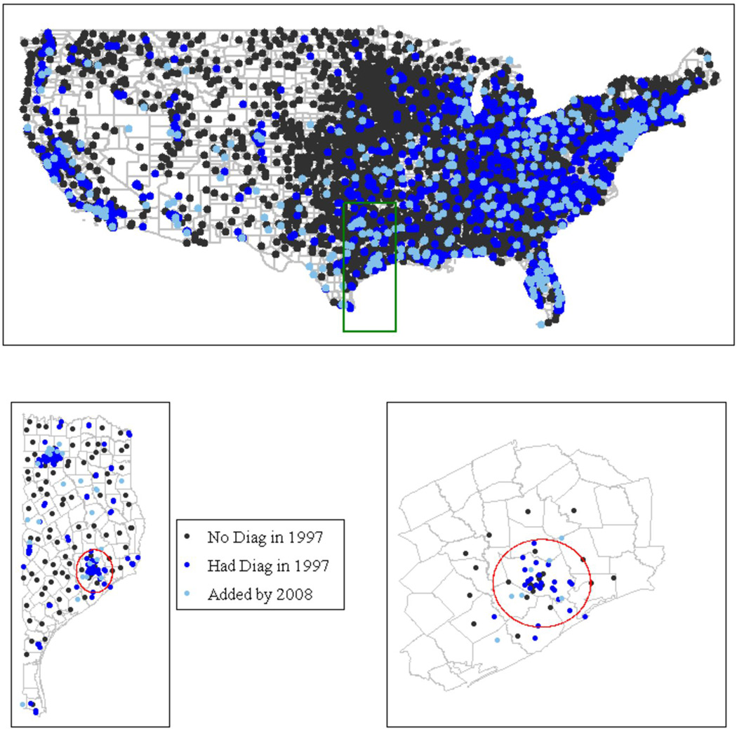
Figure 1.
New Diagnostic Angiography Adoption 1997–2008. The black dots represent the location of hospitals that did not offer diagnostic angiography in 1997. The dark blue dots represent the location of hospitals that offered diagnostic angiography in 1997. The light blue dots indicate the hospitals that offered diagnostic angiography by the end of 2008. The close proximity of the light blue and dark blue dots indicates that services tend to cluster rather than expand geographic access to care. The small map represents the Houston area, with the red circle identifying a 40 mile radius (an approximation of the market for invasive cardiac treatment based on one-hour travel time). The new services (represented by light blue dots) tend to occur near previously existing services, rather than outside of the red circle, where they might serve patients otherwise without geographic access. All dots are located according the latitude and longitude of the hospitals.

