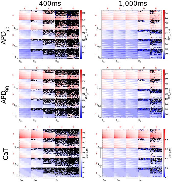
Figure 5. Dimensional stack images demonstrating the effect of simultaneously varying the magnitude of six repolarising current conductances in the Shannon model.
The top, middle, and bottom rows show the effects on APD50, APD90, and CaT, respectively. The left column is based on simulations with a CL of 400 ms and the right with a CL of 1,000 ms. In the contour plots, red represents an increase from the control value, blue a decrease, and white no change. The physiological range of APDs determined from the literature is represented by the grey region next to the colour bars in each panel. Black dots represent parameter sets with which the model did not reach steady state. In this case the optimum stack orders are not displayed; instead the order before optimisation has been used, which allowed direct comparison of the stacks to reveal differences in effects on each biomarker.

