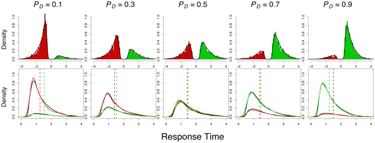
Figure 3. A comparison of model fits to empirical data.
The top row shows the aggregated posterior predictive distribution (densities) overlaid on the aggregated empirical data (histograms). The response time distribution for the immediate reward is plotted on the left (i.e., with a negative axis; red), whereas the delayed reward is plotted on the right (green). The choice probability can be inferred by comparing the relative heights of the two distributions. The bottom row shows the same distributions as overlapping density functions with corresponding colors. The model fits are shown as black densities. The median response times for the empirical data are shown as the dashed vertical lines with corresponding colors.

