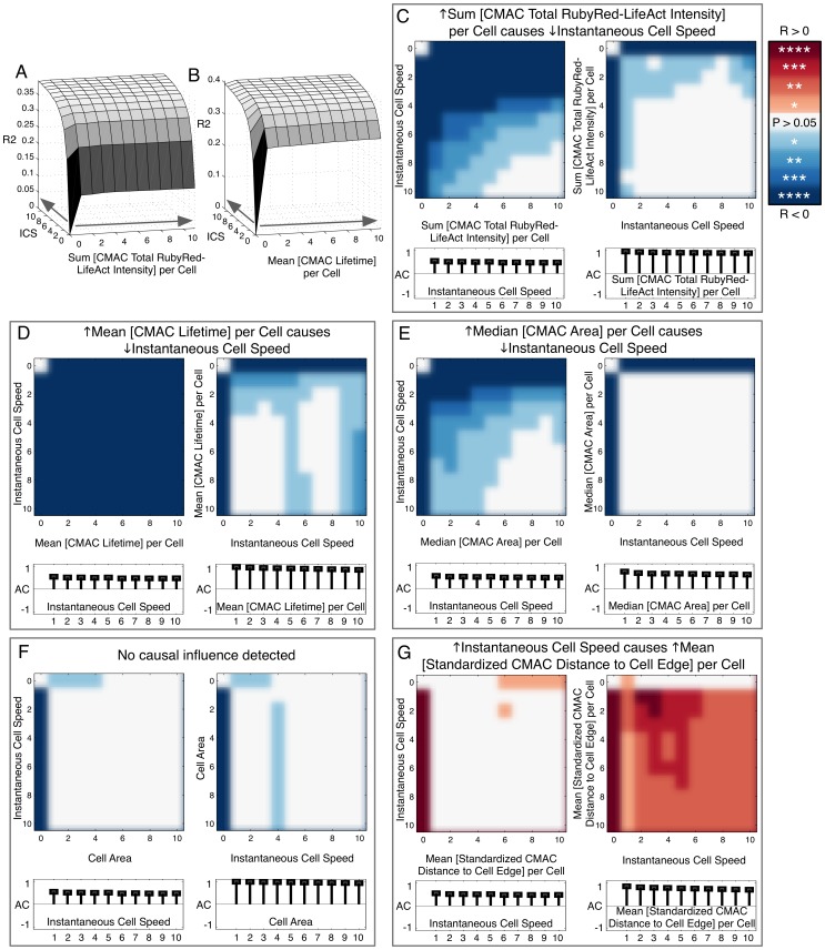
Figure 5. Mapping of directed causal influence based on Granger causality.
(A and B) 3D surface plots of adjusted R2 values (Y-axes) based on auto-regression (AR) modeling of the response variable, Instantaneous Cell Speed (ICS), using combinations of one to ten temporal lags (5 min interval) of the response variable (ICS, Z-axes) and one to ten temporal lags of a background variable, either Sum [CMAC Total RubyRed-LifeAct Intensity] per Cell (X-axis, A) or Mean [CMAC Lifetime] per Cell (X-axis, B). Grey arrows along X and Z axes indicate the inclusion of additional temporal lags of the indicated variable (A and B). (C–G) Significance testing of improvements in adjusted R2 values caused by the addition of temporal lags of background (X-axes) and response variables (Y-axes) to an AR model based on >2200 cell observations. White indicates no statistically significant improvement in prediction. Blue and red color schemes (indicating negative and positive correlations between background and response variables, respectively) are each divided into 4 levels of significance, with P values <0.05 (*), <0.01 (**), <0.001 (***) or <0.0001 (****), as indicated (color scale-bar, upper right). Causation is tested reciprocally within variable pairs to discern evidence for the causal influence of organizational variables over ICS (left panels, C–G) and vice versa (right panels, C–G). We infer causal influence only where significance-testing patterns are robust and ordered (as in C [left panel], D [left panel], E [left panel], G [right panel]. Stem plots (below X-axes, C–G, left and right panels) indicate the degree of autocorrelation in respective response variables.

