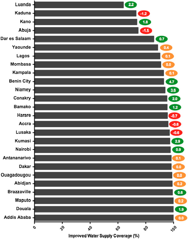
Figure 1.
Coverage Levels for Improved Water Supply. Figure 1 illustrates the most current levels of coverage and annual rate of change for improved water supply for the study cities. The cities are ranked bottom to top from most desirable access to poorest access. The colored oval on the right of each bar indicates the annual rate of change, measured in percentage points, for each city. The color of the oval indicates positive (green), negative (red), or minimal change (yellow). See Table S2 for complete data.

