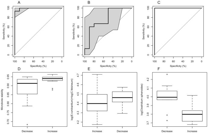
Figure 3. Predicting cholesterol responses to dietary intervetions.
Panels A, B, C: Three cholesterol response models: cholesterol response predicted by the microbiota stability (panel A), by the baseline abundance of E. ruminantium and C. felsineum (B), and by the baseline abundance of C. sphenoides (C). The data were divided randomly into a training set (75% of the data) and test set (the remaining 25%), and the ROC curves represent the ability of the models, fitted to the training data, to predict the cholesterol response (increase vs. decrease) in the test data. The ROC curve shows the true positive rate ( = sensitivity) against the false positive rate ( = 1-specificity) for the different possible cut points of a diagnostic test. The perfect diagnostic test would have a sensitivity = 1 and specificity = 1, and therefore the area under the curve (AUC) would be 1. A random guess would have a ROC curve following the diagonal; curves above the diagonal indicate that the classifier works better than a random guess. Shaded areas represent 95% confidence intervals for the ROC curve. Panels D, E, F: Comparison of cholesterol response groups (increase vs. decrease), with respect to microbiota stability (D), E. ruminantium and C. felsineum abundance (E), and C. sphenoides abundance (F).

