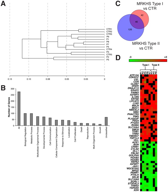
Figure 1. Gene expression profile of MRKHS patients.
A) Clustering analysis of gene expression profiles of MRKHS patients and healthy controls. The distance on the X-axis represents the similarity relationships among samples. The label CTR (1–5) represents for healthy controls, the label P (1–8) represents for MRKHS patients. B) Assignment of differentially expressed genes to biological process categories. The y-axis indicates the number of differentially expressed genes within each biological process category. C) Venn diagram of similarities and differences in type I and type II MRKHS profiles. Each of the circles depicts the number of different transcripts identified as statistically significant in the comparison of the two sample groups (type I, red; type II, blue) with healthy control (CTR). Overlapping differences shared among the two sample groups are represented in the area of intersection between the two circles (violet). D) Heatmap of the expression profile of each MRKHS patient. The cut-off for inclusion in the heatmap was the alteration of gene expression in more than half of patients.

