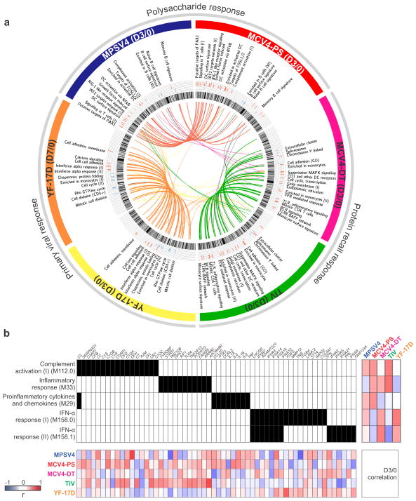
Figure 5.
BTM analysis reveals distinct mechanisms of antibody response. (a) Each vaccine data set is shown as one of six segments on the circular plot. In each segment, the inner circular bands show an ordered list of all BTM modules, layered by histograms of modules significantly correlated to the antibody response, red for positive correlation and blue for negative correlation. Significant modules that are common between vaccines (as in Supplementary Fig. 12b, c, d) are linked by a color curve in the center (gray links for modules omitted in Supplementary Figure 11). An interactive version of this figure is available (online data portal, Interactive Figure 2). (b) Illustration of module activity. A filled unit in the center grid indicates the membership of the gene (top axis) in the corresponding module (left axis). The heat map on the right shows the Pearson correlation between module activity and antibody response in each study. The bottom heat map shows correlation between module member genes and the antibody response.

