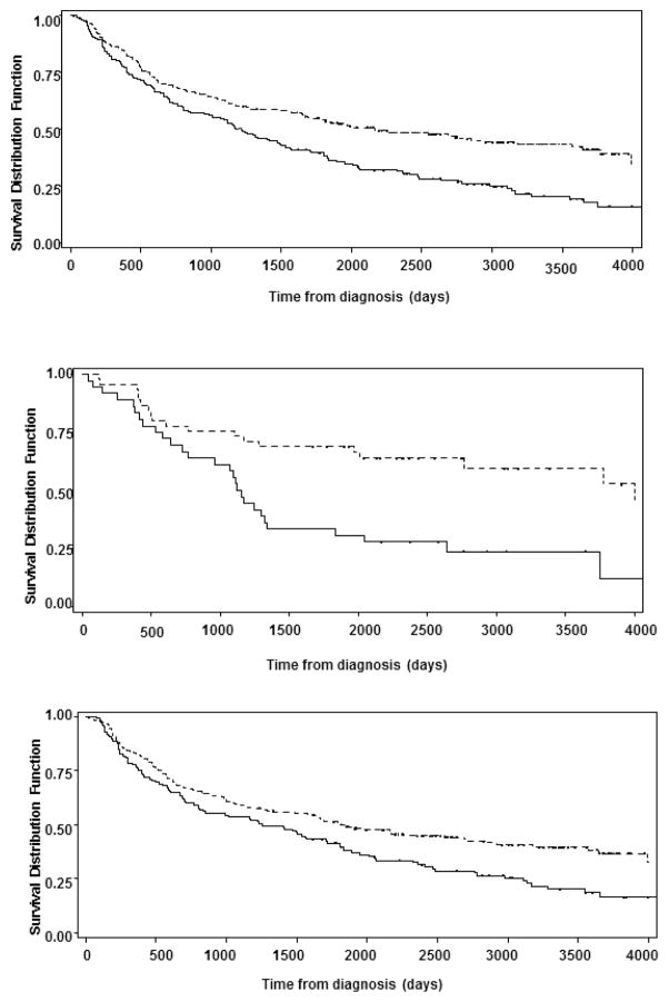
Figure 1.
Figure 1a (top): Kaplan-Meyer Curves for overall survival between African Americans and Non-African Americans. The horizontal axis represents the time of diagnosis in number days and the vertical axis represents the survival distribution in percentage. Broken Line: Non-African Americans, Solid Line: African American
Figure 1b (middle): Kaplan-Meyer Curves for overall survival in patients with oropharyngeal cancers in African Americans and Non-African Americans. The horizontal axis represents the time of diagnosis in number days and the vertical axis represents the survival distribution in percentage. Broken Line: Non-African Americans, Solid Line: African American
Figure 1c (bottom): Kaplan-Meyer Curves for overall survival for non-oropharyngeal cancers. The horizontal axis represents the time of diagnosis in number days and the vertical axis represents the survival distribution in percentage. Broken Line: Non-African Americans, Solid Line: African American

