
Figure 3.

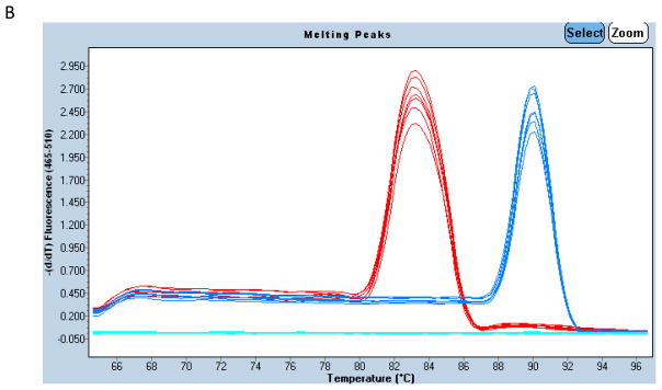
Example of qPCR amplification and melting curves. Amplification curves for BCL7B (left-hand cluster) and CFTR (right-hand cluster) from 7 DNA samples on one 96-well plate is shown in panel A. Fluorescence is plotted on a log scale against cycle number. Each amplification curve crosses the horizontal cycle threshold line at a certain cycle threshold number (CT) which is then used for quantification. Absolute copy number (B) Melting peaks for BCL7B (left) and CFTR (right) PCR products produced in (A). The single peak for each product in all samples indicates lack of contamination and primer–dimers.