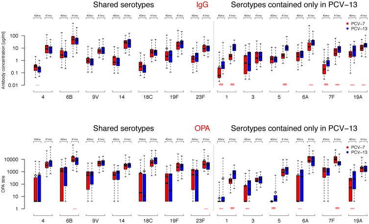
Figure 4. Serotype-specific IgG GMCs and OPA GMTs.
Box plots of IgG GMCs and OPA GMTs for each of the serotypes before (40 months, 40 mo) and after (41 months, 41 mo) the PCV-13 booster. The median is shown as a line across the box with the box extending to the lower and upper quartiles, respectively. The whiskers extend to the maximum or minimum values within 1.5 times the IQR above and below the 3rd and 1st quartile, respectively. Points outside this range are represented as dots. Means are shown as a diamonds and t-test were performed for each serotype at each time point between the groups with p-values being represented as red lines if significant (1, 2, 3, and 4 lines if p≤0.05, ≤0.01, ≤0.001, and ≤0.0001, respectively).

