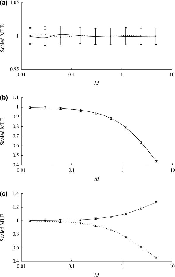
Fig. 3.
Data were simulated using population structure shown in Fig. 1b with different migration patterns. (a) Migration between Pop. A and Asc. 1. (b) Migration between Pop. 1 and Pop. 2. (c) Migration between Pop. 2 and Pop. A, and Asc. 1. Population migration rates range from 0.015 to 4.8 migrants per generation. For each combination of migration pattern and migration rate, 1000 data sets were simulated. Scaled average of 1000 maximum likelihood estimates was plotted against the migration rate, with bars representing scaled standard deviations. Solid line represents the estimate of T1. Dot line represents the estimate of T2.

