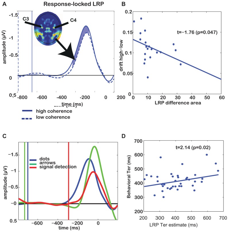
Figure 3. Response-locked LRPs and individual differences for Experiment 1.
(A) Grand average response-locked LRP, demonstrating the difference between low and high coherence conditions. Vertical lines indicate stimulus onsets for the respective conditions. Shaded area indicates the time window where low and high-coherence differ significantly (t-test with p<0.05). Inset shows a topographical map (nose up) of lateralized EEG activity, demonstrating that electrodes C3 and C4 are maxima of this measure. (B) Individual differences in DDM estimate of drift rate correlate with area between curves of high- and low-coherence LRPs. Each dot reflects the difference between low- and high-coherence drift and area between LRP curves for a single participant. (C) Grand average response-locked LRP demonstrating the difference between integration and non-integration conditions. Blue trace reflects the evidence-integration condition (average of low- and high-coherence trials). Red reflects a task condition where the participant has to press a pre-specified button, whereas green shows trials on which a participant is instructed by an arrow cue which button to press. Vertical lines indicate dot-motion onsets for the respective conditions. (D) We estimated non-decision time  from the LRP by adding the time until departure from baseline to the distance between LRP peak and the actual motor response. The thus-estimated neural
  correlates with the behaviorally-estimated
  . Each dot reflects data from one participant in one condition (low or high coherence).

