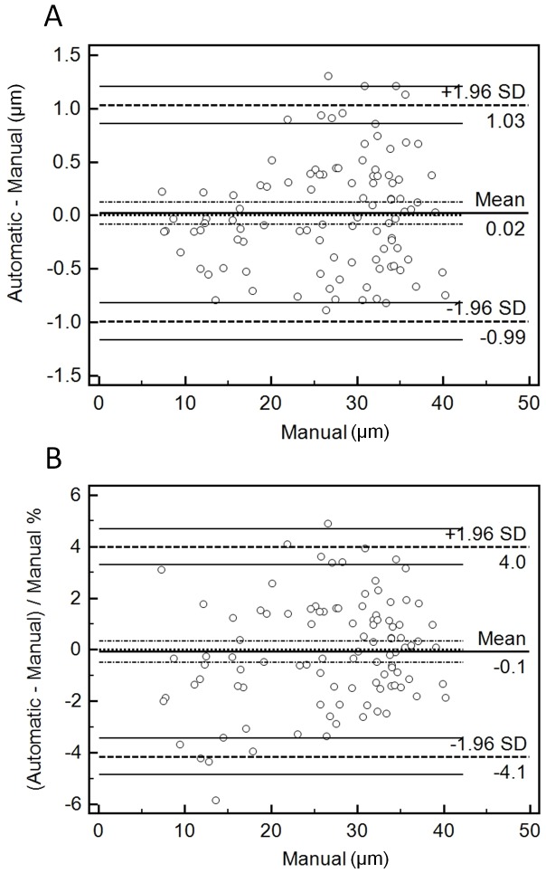
Figure 4. Bland-Altman plots.
A. Plot of the difference between automatic and manual measurements against the manual ones (used as ‘gold standard’). The Mean line is indicated in the middle of the plot, giving the overall mean of the differences. Dashed lines are shown immediately on top and bottom of the Mean line indicating the 95% confidence intervals. Another dashed line marks also the equality line (difference of 0 between automatic and manual). Two further dashed lines are also drawn at the top and bottom of the plot indicating the ±1.96 SD limits of agreement, with their respective 95% confidence intervals. Each circle indicates an individual raw difference. B. Same as in A, but in this case percentage values are plotted instead (relative to the width of the vessels).

