
Figure 3.
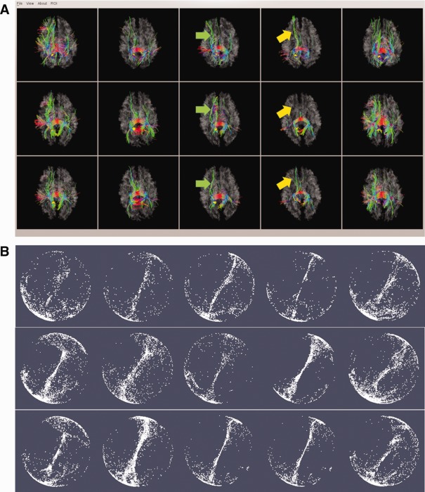
An example of DICCCOL‐PCE prediction and optimization. (a) The fiber bundles of the DICCCOL (represented by yellow sphere). The top row are five models from UGA dataset [Zhu et al., in press]; the middle row are the predicted DICCCOLs in five PCE affected brains; the bottom are optimized DICCCOLs for the same five PCE affected brains after prediction. (b) The corresponding trace‐maps in Figure 3a. The within‐group tracemap distances for this DICCCOL is 1.60/1.40 (prediction/optimization). [Color figure can be viewed in the online issue, which is available at http://wileyonlinelibrary.com.]