
Figure 9.
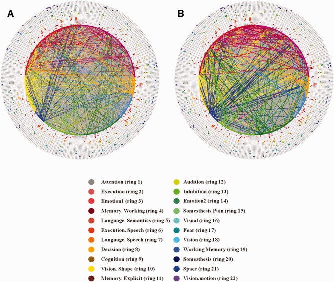
Result interpretation of connectomics signatures of PCE. For the visualization scheme in (a) and (b), 358 DICCCOL‐PCE ROIs are represented by an inner ring of color‐coded nodes, connections (corresponding to those in Figure 8d,e) are represented by lines, and 22 functional networks are represented by 22 outer rings of colored nodes. All of the colored nodes in each ring of 358 nodes stand for a functional network. The names and colors for 22 networks and their corresponding rings are shown in (c). (a) Increased functional connectivities in PCE in comparison with controls. (b) Decreased functional connectivities in PCE in comparison with controls. (c) Names and colors of top 22 functional networks that are most frequently involved in the hypo‐ or hyper‐functional connectivities in this article. [Color figure can be viewed in the online issue, which is available at http://wileyonlinelibrary.com.]