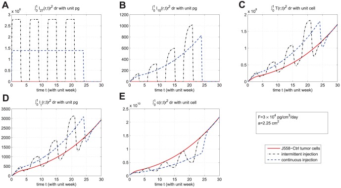
Figure 6. Comparison of continuous versus intermittent treatment.
(A), (B), (C), (D), and (E) are the profiles of total number of  , and
, and  , respectively, for model (6) with
  which the first equation for
  is replaced by (7) and all parameter values are taken from Table 6. In (E), the upper curve is for J558-Ctrl tumor cells, the dotted-dashed curve (
 ) is for intermittent injection, and the dashed curve is for continuous injection with
  and
and  , for the first
  weeks.

