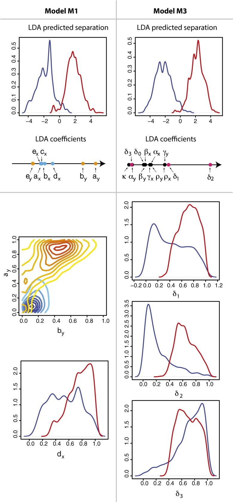
Fig. 4.
Linear discriminant analysis was used to predict the key differences between remission and relapse. For (Left) model M1 and (Right) model M3, clear separation between disease outcomes can be made (Upper). The parameter contributions (coefficients) to the linear discriminant are shown on a horizontal axis. For model M1, the healthy parameters are represented by blue dots and the leukemic parameters by orange dots; for model M3, the pink dots designate the death rates. (Lower) Shown for model M1 is a density plot of  against
  with the location of remission outcomes marked in blue and the relapse outcomes in red: using only these two parameters a good separation is already achieved. We also show the posterior density distribution of parameter
  alone in case of remission (blue) and relapse (red)—moderate separability is observed. For M3 we show the posterior density distribution for each of the death rates and we see that for
  , remission (blue) and relapse (red) can be well distinguished.

