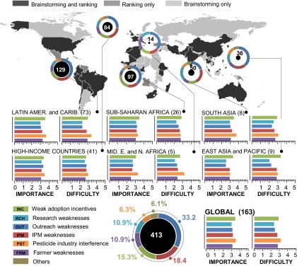
Fig. 1.

Summary of a concept map identifying obstacles to IPM in developing countries. The world map captures the global participation in developing the concept map. Doughnut charts represent the proportion of open-ended responses that matched one of six obstacle themes or were otherwise assigned to the generic category “others.” The size of the circle inside each doughnut is proportional to the number (labeled in or next to it) of open-ended responses. Bar charts represent ratings on a scale from 1 to 5, ranging from least to most important or difficult obstacle. The number of rating responses is presented in parentheses next to the region’s name. Responses from Europe and Central Asia were omitted from the graph because of poor representation.
