
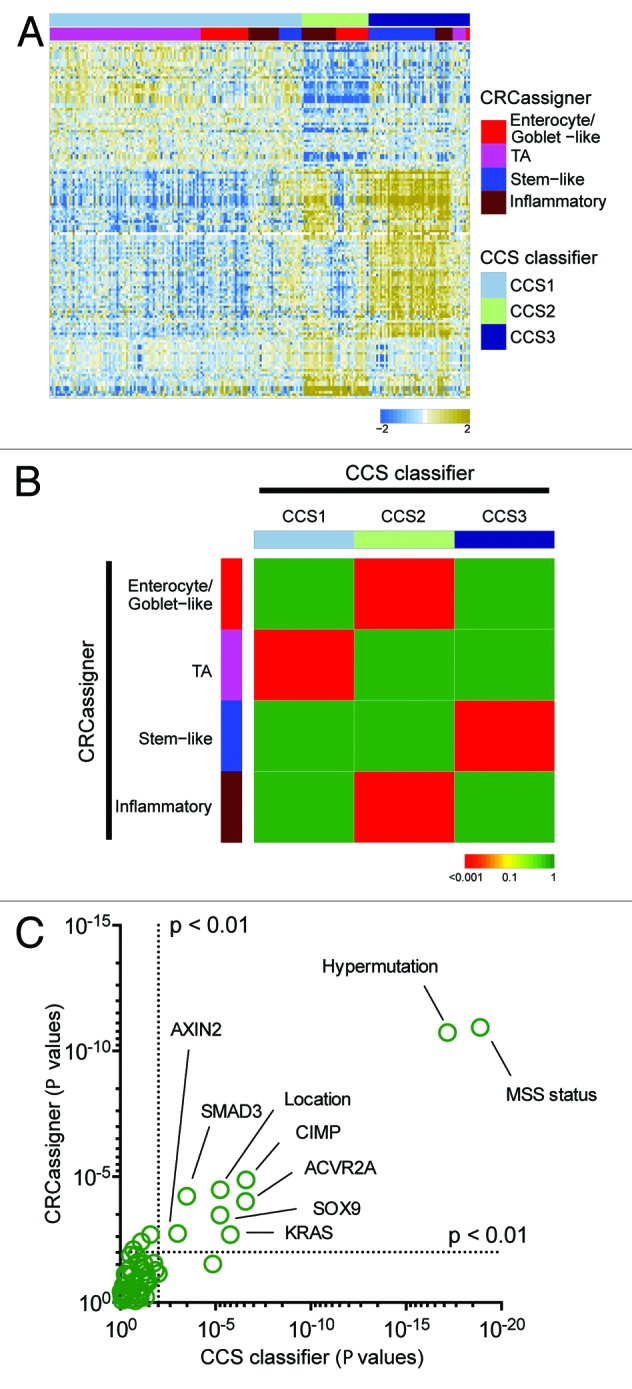
Figure 3. Validation in the TCGA data set. (A) Heatmap depicts the TCGA data set classified by both taxonomies. Columns represent patients; rows indicate genes from the CCS classifier. Colors represent relative gene expression levels; blue signifies low expression, and brown, high expression. (B) Heatmap indicates association of CRCassigner subtype samples (left) with CCS group samples (top) for the TCGA set. Colors indicate significance of association; green signifies a low association, and red a high association. P values are determined using hypergeometric tests. (C) Graph depicts the association of clinical and (epi)genetic characteristics with both classification methods for the TCGA data set. Features that are significantly associated with both classification schemes are indicated. P values are determined using Chi-square tests.