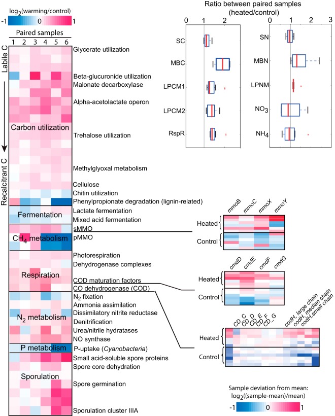
FIG 3.
Changes in relative abundance of pathways as an effect of warming. The heat map on the left represents changes in the abundance of different pathways (rows) for each pair of samples (columns), color coded based on the magnitude of the change (see scale on the top left). For selected pathways related to the emission of greenhouse gases, the relative abundances of the individual genes that constitute the pathways are shown on the right (small heat maps; rows represent samples, and columns represent genes). In this case, changes in abundance represent deviations from the average abundance of the gene in all 12 samples, are color coded based on the magnitude of the difference (see scale on the bottom right), and are generally consistent with the results for the whole pathway. The results of physicochemical measurements are represented by box plots on the top right. The vertical lines at ratio 1 indicate no change between heated and control samples; the medians of six paired replicate samples are marked by the red bars; the first and third quartiles are represented by the left and right boundaries of the boxes, respectively; the left and right whiskers represent the 1.5 interquartile range; outliers are marked by red asterisks. Abbreviations: SC, soil carbon; MBC, microbial carbon; LPCM1 or -2, labile pool 1 or 2 of carbon, microbial; RspR, respiration rate; SN, soil nitrogen, MBN, microbial nitrogen, LPNM, labile pool of nitrogen, microbial; s- or pMMO, soluble or particulate methane monooxygenase, respectively.

