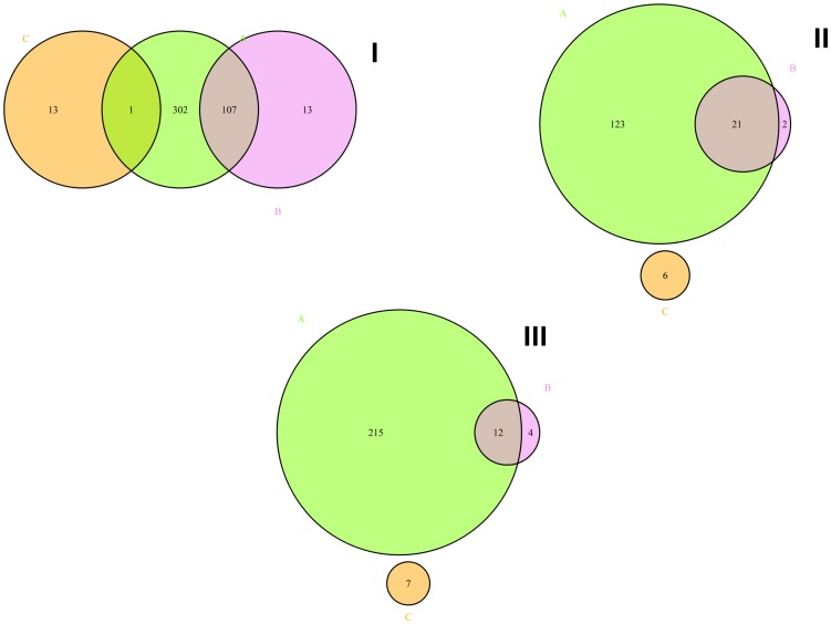
Figure 2. Venn diagram illustrating the significantly affected genes (A, chartreuse color), isoforms (B, violet color) and differential promoter use (C, orange color) found in the LV vs. mock (I), Lena vs. mock (II) and LV vs. Lena (III) comparisons.
I. Venn diagram illustrating the significantly affected genes (A, 446), isoforms (B, 187) and differential promoter use (C, 14) found in the LV vs. mock comparison. II. Venn diagram illustrating the significantly affected genes (A, 153), isoforms (B, 72) and promoters (C, 6) found in Lena vs. mock comparison. III. Venn diagram illustrating the significantly affected genes (A, 241), isoforms (B, 34) and promoters (C, 7) found in LV vs. Lena comparison. The chartreuse circle, “A”, corresponds to the differentially expressed genes (I. LV vs. mock, II. Lena vs. mock and III. LV vs. Lena). The violet circle, “B”, represents the differentially expressed isoforms (I. LV vs. mock, II. Lena vs. mock and III. LV vs. Lena). The orange circle, “C”, corresponds to the differentially used promoters(I. LV vs. mock, II. Lena vs. mock and III. LV vs. Lena).

