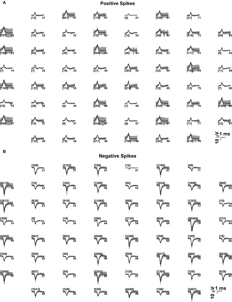
Figure 6.
Average voltage waveforms, corresponding to (positive or negative) peak-detection events at each microelectrode. Each subplot represents graphically the 8 × 8 layout of the MEAs employed in this study (see the Methods). The average voltage trajectories (thick black lines) of the positive (A) or negative (B) threshold crossing events are displayed for each microelectrode, together with its point by point variability (gray shading, i.e., standard deviation), and with the number of events among brackets. The numbers on the right hand side of each subplot denote the labeled electrode name.

