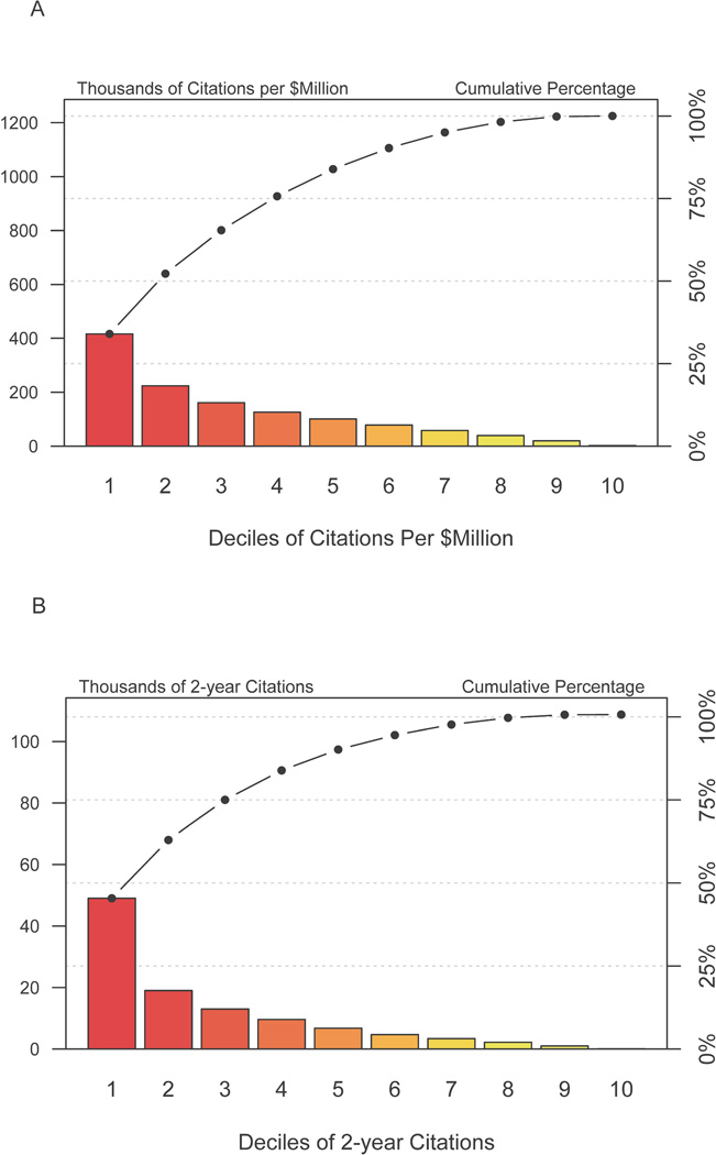
Figure 1.
Pareto plot of citations per grant for 1492 grants that met inclusion and exclusion criteria. The X-axis divides the grants into deciles according to the number of total citations that each grant’s papers received. The red bars shows the number of citations received within each decile of grants, while the line graph shows cumulative values going from the best to worst producing deciles of grants. The top 3 deciles (e.g. the 30% most productive grants) generated 76% of the total citations.

