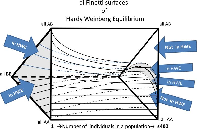
Figure 4. Di Finetti Diagram.
A de Finetti diagram is used to graph genotype frequencies in populations. It presumes two alleles, and can be used to plot genotype frequencies at which Hardy-Weinberg Equilibrium (HWE) is satisfied. The figure shows a rectangular prism with surfaces plotted in its interior. The vertices of the triangles on the ends of the prism correspond to genotypes as shown: AA, AB and BB. The length of the prism is a scale of individuals in the population from 1 (far left) to ≥ 400 (far right). The area between the upper and lower internal plot surfaces define the combinations of genotypes that are consistent with HWE given a particular population size. As the population size increases, an increasingly small proportion of all of the possible genotype combinations are in HWE. However, difference between the in-HWE and out-of-HWE regions changes increasingly gradually as the population size reaches hundreds of individuals. For this reason, a data set of 100's of individuals allows stringent criteria to be used in assessing whether a set of genotypes is out of HWE—potentially due to misalignment.

