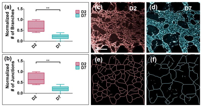
FIGURE 4.
Quantification of microvascular network formation within 3D FGSs at days 2 and 7. (a)–(b) Quantification of microvascular network formation within 3D FGSs. Box and whisker plots show the decreasing normalized numbers of branches and junctions between days 2 (D2) and 7 (D7), respectively. The normalized value is defined as the value divided by the maximum value for any given data set. The maximum values of branches and junctions were 365 and 225, respectively. Results are within six different devices at three different times (N = 3). Data are plotted as median with upper (75%) and lower (25%) quartiles. Error bars represent max and min values (** p < 0.003). (c)–(d) Representative confocal microscopic images at days 2 (D2) and 7 (D7), respectively. Scale bars, 300 μm. (e)–(f) Corresponding skeletonized images of (c)–(d).

