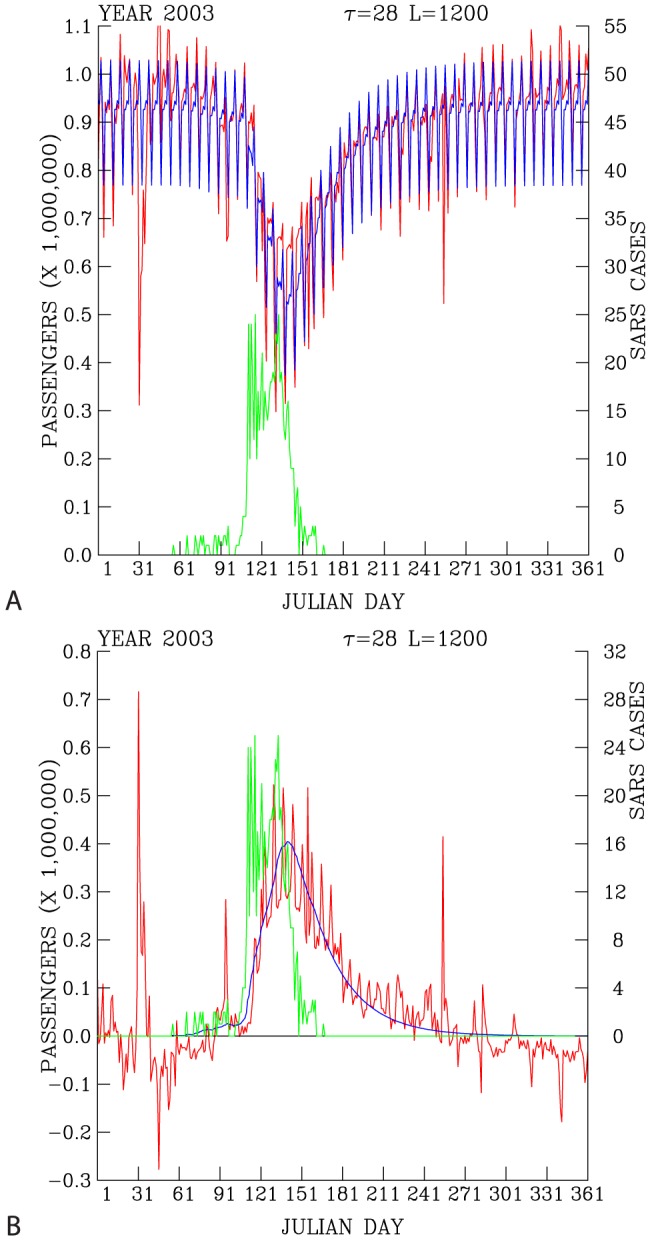
Figure 5. Predicted (blue curve) and actual (red curve) daily ridership (A).

Difference in the change of actual daily ridership with respect to the statistical prediction (statistical model-2003 daily ridership; red curve) and the dynamical model prediction (dynamic model - 2003 daily ridership; blue curve) (B). Daily reported SARS cases are shown as green curves. Both data are for 2003.
