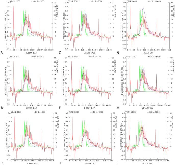
Figure 6. Difference in the actual daily ridership (red curves) and the predicted daily ridership (blue curves) with respect to a combination of three instantaneous passenger reduction rates ( ) and three passenger
  -folding time (
 ) scales.
For plots in the columns from the left to the right showing  = 14, 21, and 28 days, respectively. For plots in the rows from the bottom to the top showing
  = 1200, 1600, and 2000 ridership loss rates per reported SARS case, respectively. Green curves show daily reported SARS cases. These data are shown for 2003.

