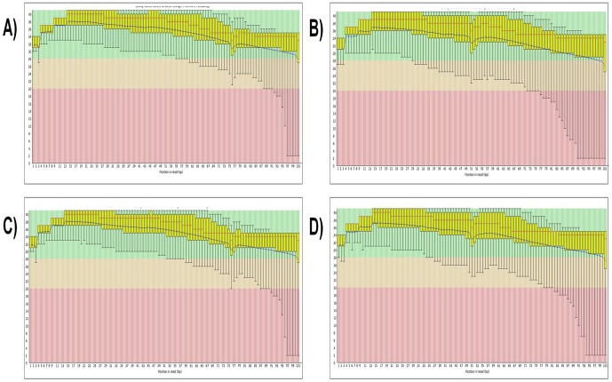
Figure 3. Per base sequence quality of MyoGwd and MyoGkd.
Quality scores of A) & B) MyoGwd, and C) & D) MyoGkd. The y-axis on the graph shows the quality scores with higher scores indicating better base calls. The background of the graph separates the y axis into high-quality calls (green), calls of reasonable quality (orange), and calls of poor quality (red). In each of these findings, the red line is the median value, the yellow box corresponds to the inter-quartile range (25–75%), the upper and lower whiskers represent the 10% and 90% points, respectively, and the blue line signifies the mean quality.

