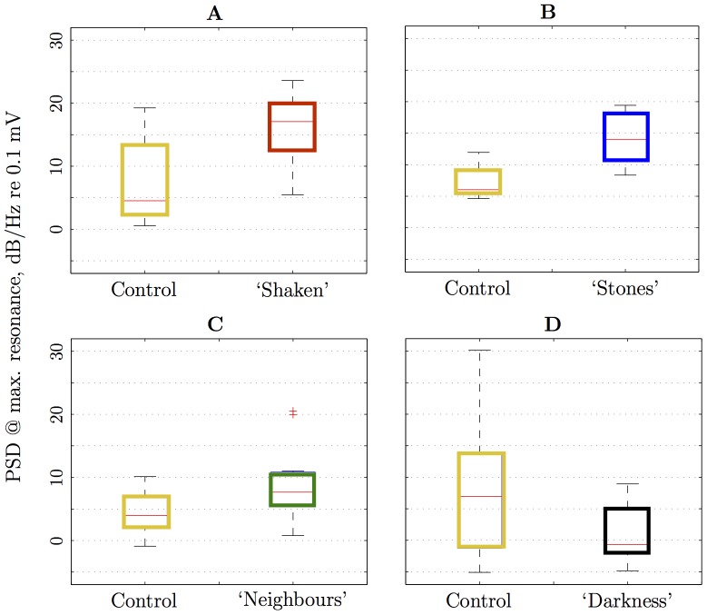
Figure 4. Box-plots of peak power spectral density (acceleration).
Measurement for various treatments against control (‘Illuminated’): A ‘Shaken’; B ‘Stones’; C ‘Neighbours’; and D ‘Darkness’. Each box gives the lower quartile, median, and upper quartile values; whiskers correspond to the most extreme data values within 1.5 times the inter-quartile range are depicted from the ends of the box; outliers are data with values beyond the ends of the whiskers and displayed with a red+sign [29].

