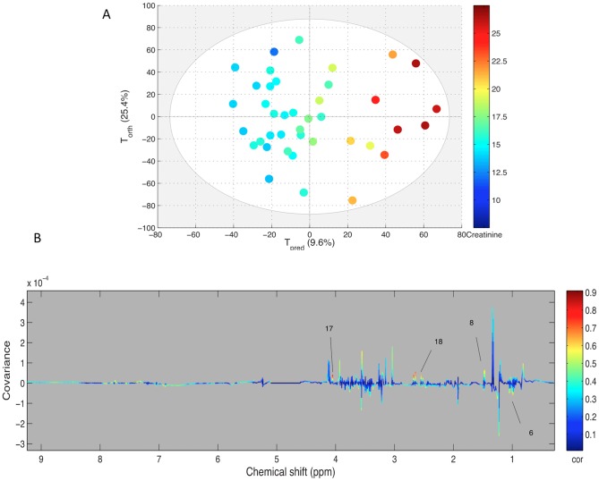
Figure 4. A: Score plot of the OPLS model computed with PE samples according to their creatinine content assessed by biochemistry.
Tpred represents the predictive axis and Torth, the orthogonal axis. Each dot corresponds to a spectrum, colored according to their creatininemia. B: Loading plot of the score plot predictive axis. The metabolite correlations are represented by the color scale. Positive signals correspond to metabolites which concentration increases when creatininemia increases. The buckets are labeled according to metabolite assignments of figure 1.

