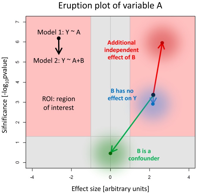
Figure 2. Schematic visualization for the interpretation of the eruption plot.
The results of two models can be compared in the eruption plot. The arrows of an eruption plot can have different sizes and directions. This scheme helps to interpret the arrow. Effect size is displayed along the x-axis and the significance on the y-axis. The red area shows the region of interest (ROI).

